
Webinars have been a mainstay of the content marketer’s toolkit for years—and with good reason. They’re an inexpensive and convenient way to generate leads, convert prospects, and onboard new customers. In fact, it’s common for webinars to convert anywhere between 5% and 25% of attendees into paying customers.
But even if you’ve chosen a killer topic, booked the perfect guest speaker, and gotten hold of some Hollywood-grade video recording equipment, it won’t count for a thing if no one actually signs up to attend your webinar.
In order to pull off a successful webinar campaign, you’ll need a thought-out promotion strategy that informs your audience about the event and gives them a compelling reason to sign up. The focal point of this promotion strategy is the webinar landing page. This is where you have a chance to entice your visitors and convince them that registering for the webinar will be worth their while.
But not all webinar landing pages are created equal. Some do a far better job than others at persuading visitors to sign up. That’s why, in this post, we’ll walk you through eight key tactics to help transform your webinar landing page into a well-oiled conversion machine.
1. Craft a headline that resonates
If you think of your landing page as the focal point of your webinar promotion strategy, then your headline is the focal point of your webinar landing page.
The importance of nailing the headline is hard to overstate since about 80% of people will read headline copy, but just 20% will read the rest of the page.
So how do you craft a headline that reels your readers in?
As a rule, your headline should highlight a concrete benefit that your audience will get from attending your webinar. That is, it should play on something the prospect cares about—a problem, a need, an ambition—so that they feel compelled to read on. The headline isn’t the place to start discussing your product features or the nitty-gritty details of the webinar’s subject matter.
Even though there’s no one-size-fits-all formula for writing a compelling headline, the following approaches will often work to capture the reader’s interest:
- Quantifiable results: Most people that attend webinars are seeking some practical benefits to apply in their personal or professional lives. You’ll make your headline more convincing if you can attach some solid figures to these benefits. For example: “Discover how [webinar topic] could boost your revenue by [X]% over the next [X] months.”
- Real-life examples: Sometimes a headline laced with impressive figures can seem too good to be true. As an alternative, you could draw upon relevant real-world examples to convince your readers that the benefits you promise are realistic. For example: “Discover how [person’s job/title] achieved [goal/task] in [X] weeks.”
- Urgency: One of the best ways to grab a reader’s attention is to use words in your headline that generate a sense of urgency. People don’t like the idea of missing out on something valuable, and so tapping into this FOMO (fear of missing out) can be an effective way to convince people to read on. For example: “Want to learn how to [solve pain point] in [X] simple steps? Register now before it’s too late!”
Don’t forget, your headline copy should also be clear and to the point. Leaving your readers confused about the value your webinar will provide could easily turn them away.

Try Leadpages free for 14 days
Easily create your website and landing pages with the only platform engineered by marketing nerds.
2. Write clear and precise body copy
Once you’ve managed to hook your visitors with a well-crafted headline, the rest of your webinar landing page copy should work to make registration a no-brainer.
You’ll want to strike a careful balance between explaining what the webinar is about—being sure to highlight key event details like start time, date, and cost—and keeping the total word count to a minimum. You don’t want to put off visitors with an intimidating wall of text.
Make it obvious what your audience will learn from having attended your webinar, and how that knowledge will improve their business or solve a problem they are experiencing. The simplest way to do this is to include a bullet list of a few key benefits, like in the following example from communications agency, Platinum PR:
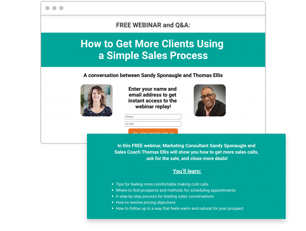
Remember that the tone of your copy is just as important as the information you pack into it. To keep the tone friendly and vibrant, address your visitors as “you” and use the active voice over the passive voice. For example, go for “The webinar helped previous attendees to…” instead of “Previous attendees were helped by the webinar to…”.
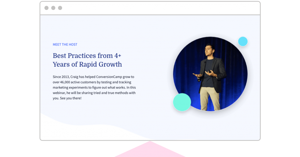
3. Share a little bit about the speaker
People signing up for a webinar want to know that they’ll be having a conversation with a real person, not just some faceless business. By revealing a little bit about yourself, you’ll help to reassure your visitors that the webinar will be a lively, authentic experience. This is especially important if you’re marketing the webinar to people who aren’t familiar with you or your brand.
Be sure to choose an approachable photo of you and any guest speakers. From looking at multiple presenter-photo split tests, we’ve found that an informal background and a big smile tend to work best.
It’s also important to include any relevant credentials along with your headshots. These will increase your credibility and let visitors know that you’re qualified to give an expert presentation on the topic at hand.
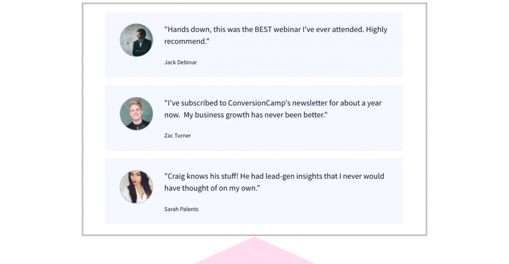
4. Use testimonials
Speaking of credibility, there’s no better way to convince your visitors that your webinar will deliver on its promise than to showcase some testimonials from previous attendees. After all, up to 88% of consumers trust online recommendations as much as they do recommendations from their friends.
Including a few glowing testimonials on your webinar landing page will reinforce the perception that you know how to fix your target audience’s pain points. Simply select two or three blurbs from previous attendees who were happy with their experience and, if possible, include headshots for each. Ideally, each testimonial will highlight a different positive aspect of attending the webinar.
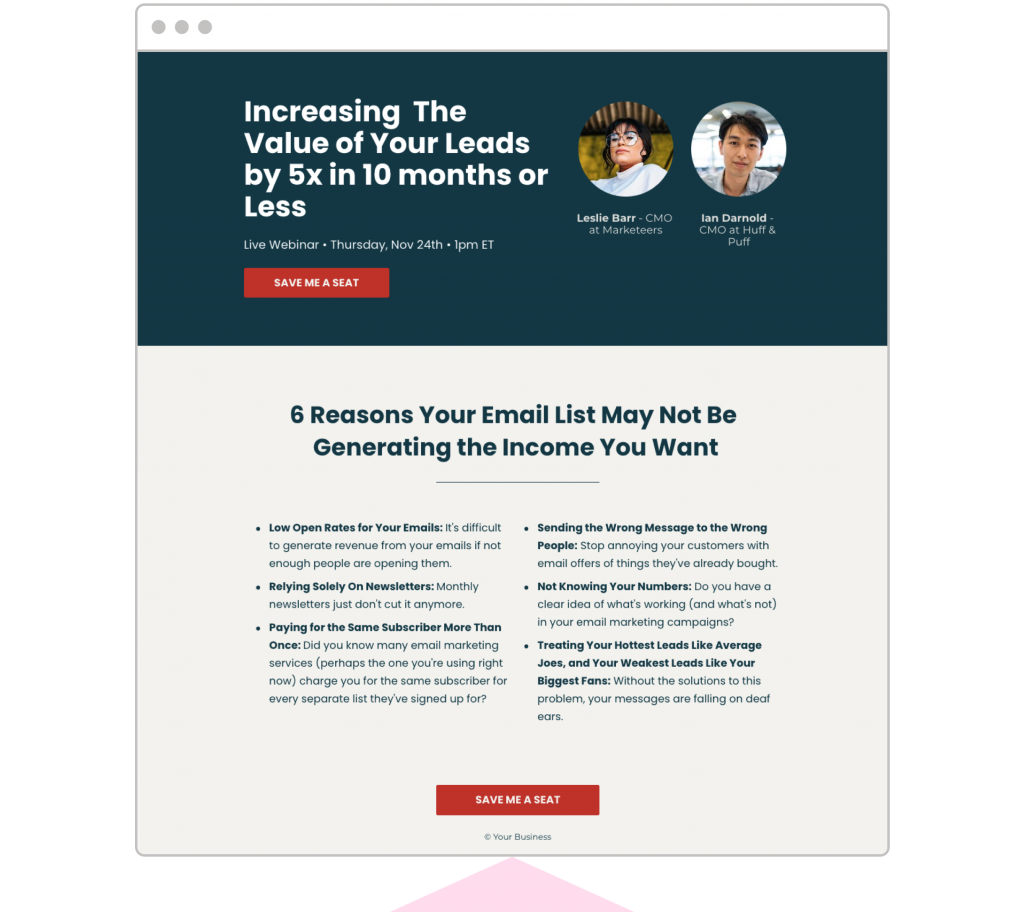
5. Provide multiple opt-in opportunities
One of the main challenges of marketing is to persuade your prospects to complete a specific action. If you ask too much, you risk coming across as too pushy. But if you ask too little, people won’t know what you want them to do.
The same holds for your webinar landing page. You should include enough opt-in opportunities so that users can easily take the desired action wherever they are on the page, but not so many that they feel you’re trying to bulldoze them into signing up.
You can usually find the right balance by ensuring you have two opt-in buttons on the page: one at the top to reinforce your headline, and one at the bottom for the user to click once they’ve read all the information on the page.
As a general rule, we recommend including one opt-in opportunity every three screen lengths.
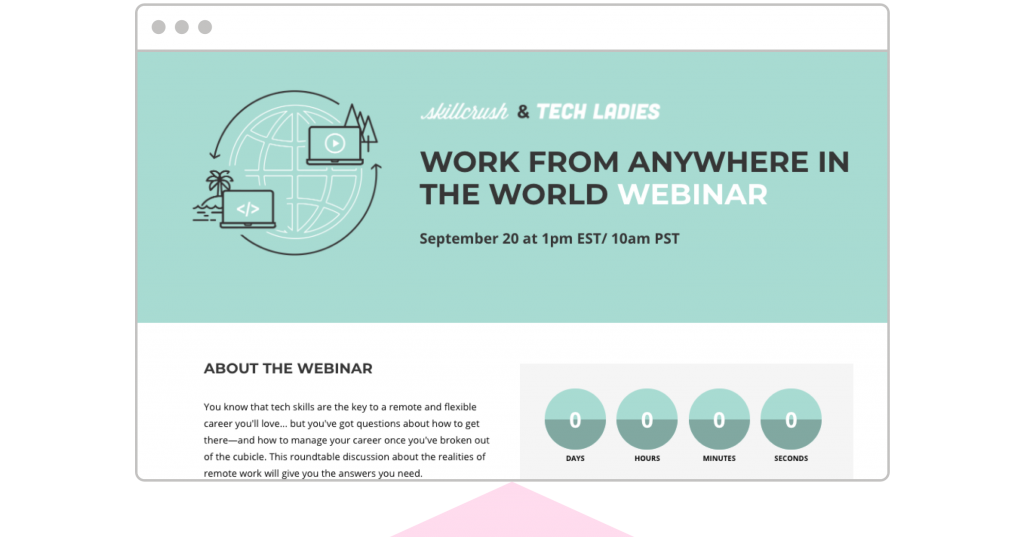
6. Create a sense of urgency with a timer
We’ve already seen how creating a heightened sense of urgency in your webinar landing page headline can motivate visitors to read more and ultimately sign up.
Another powerful way to reinforce this effect is to include an on-page countdown timer that
lets visitors know how long they have left to secure their spot in the webinar. The ticking clock is a strong visual indicator that the user’s chance to register will soon expire, which can serve as an effective nudge to get them to sign up. In fact, ramping up the sense of urgency on your landing page can increase conversions by as much as 30%.
Be sure to place your countdown timer in a prominent position so that it grabs the attention of users. You should take care not to set the deadline too far in the future, since the sooner the offer expires, the more users will feel the urge to sign up. In fact, on average, 29% of attendees won’t register until the day of the webinar itself. So anything greater than 7 days is unlikely to stir most users into action.
7. Pay attention to page design
In our Definitive Guide to Landing Pages, we look at how to structure your content in such a way that you create a seamless user experience.
Your top priority when it comes to your webinar landing page design is to create a frictionless path to conversion. If your visitors feel like the layout of your page is clunky, confusing, or otherwise unpolished, they may start to wonder whether your webinar will suffer from similar quality issues.
Here are a few basic design principles to help you structure your page:
- Establish the visual hierarchy: While you want your entire page to look good, you also want to draw a visitor’s attention to the important information first and sequence it in the order that makes the most logical sense. Think of the page as a conversation: flow is key.
- Keep it simple: Are there areas you can simplify? There’s no room for excess on your landing page—if a particular design feature doesn’t draw the user towards a conversion, leave it out.
- Stick to your color palette: Select 3 or 4 complementary colors that align with your brand, and reserve a single, high-contrast color for your call-to-action buttons.
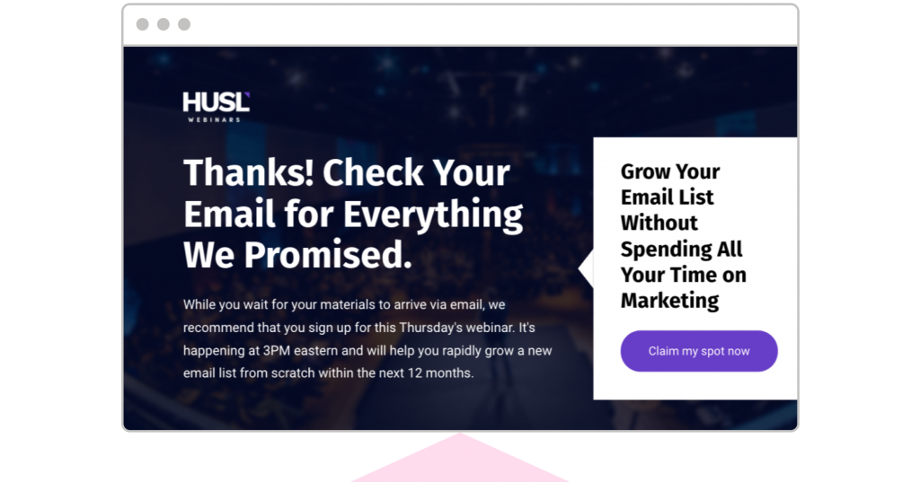
8. Include a thank you page
Once a visitor has signed up for your webinar, you should follow it up with a thank you page. Thank you pages are often overlooked by marketers, but they offer a few benefits that can help make your webinar a bigger success.
First, they reassure the user that their registration has been confirmed and give you a chance to demonstrate your gratitude (which goes a long way!).
Second, you can use a thank you page as a way to encourage registrants to take some additional action, such as sharing the webinar with a friend or signing up for a related course on your website.
Lastly, a thank you page can improve the odds that registrants will actually attend your webinar by including things like:
- Buttons that let registrants add the event to their Outlook, Google, or iCalendar calendars
- Free resources that you’ll refer to during the webinar
- A short welcome video to get them excited about attending the webinar
- A teaser of special bonuses that will only be available during the event
Ready to build your own webinar landing page?
Creating a conversion-optimized webinar landing page is no mean feat, but the tactics covered in this post will help lay the foundations of success for your next webinar campaign.
If you want to make things a little easier, don’t forget that our drag-and-drop landing page builder gives you access to dozens of stunning, mobile-responsive webinar landing page templates.
Start your 14-day free trial today and pack your webinar to the rafters!
Try Leadpages free for 14 days
Easily create your website and landing pages with the only platform engineered by marketing nerds.
Wondering what to read next?
Here’s what we suggest:
→ How to Nail Your First Virtual Event for Your Business
→ How to Create a Video Landing Page in 6 Easy Steps
→ How Laurie Wang Uses Leadpages to Achieve 60%+ Conversion Rates


